- Jan 10, 2018
How Color Psychology Influences Your Business Website’s Profit
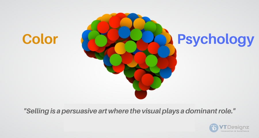
Selling is a persuasive art where the visual plays a dominant role.
When you see anything, its color is the first thing that your brain registers. Smell, sound and shape, and texture follow together making the final impact.
Colors have dramatic effects on human emotions – they can inspire, motivate, soothe or agitate the mind. Leveraging color psychology can make your online presence stand out in a crowd of competition attracting more business and nearing your goal of earning more.
Instant brand recognition by your target group is a must and not a choice.
This is best done by the calculated use of colors and leveraging the effects that colors play on human minds. Knowing how to influence customers with colors means effectively pursuing them to engage with your brand and earn more profits. It is only natural that companies are paying special importance to a prudent choice of color used for both online and offline use.
Color Psychology Marketing by corporates
Colors are largely responsible for the growth and development of brand personalities, defining their ethos and instant recognition. Corporates are spending more researching the psychological effects of color on human behavior and use it to influence consumers. This, of course, is not without reason!!! Studies show that most buying decisions of commercial products both in retail stores and online are taken on the basis of colors alone. When launching new products or even websites, large companies devote resources to find out not just the colors but also their hues that best capture consumers’ imaginations. The starting point is choosing a shade from its existing brand identity unless of course going for a makeover. After all, brands' personalities are closely associated with the colors that their logos carry. The human brain recalls memories of objects that they have been seeing and instantly correlates colors with them.Influence your online visitors with the right colors
Pick your niche to choose the right color for your website and influence the mood of your visitors and gain their confidence. If need goes in for a color overhaul of your website using the power of colors and sees a windfall of business come through! Also Read: 10 Tips To Make Your Website Design Worth Multi-Million Dollars Experts opine that the use and influence of colors in different digital channels are exactly similar to in-store customer experiences. The ultimate goal of color combinations is to trigger the call to action of buying. While other senses are more difficult to target while selling online, the color impact of evoking and inspiring strong emotions can trigger great sales!!! Keeping this in mind, your brands need to build a univocal visual image using the relevant color themes across digital channels like websites, social media that are copies of their physical presence. Consumers expect consistency no matter what age or group they come from. Only that online representation calls for a brighter shade such that they appear similar to that of the real physical presence to help consumers build the connection.Color preference differ according to Genders
In fact, color influences are also gender-specific making their selection an even delicate task. Women, in general, have an aversion to earthy tones like brown and gray. Their preferences lie in purple, orange, and red. Men generally show a dislike for purple and orange liking blue, black, and green in ample doses. This is best seen in e-commerce sites that target the respective groups. The most effective color selection can be done only after you have made a fine analysis of customer behavior. Men have different color preferences than women. It is important to understand to analyze the ratio and number of men and women that you are trying to target.The major color Psychologies
Here is how different colors have come to represent moods and emotions according to their effect on human brains. You can use these influences to attract more customers, stir their emotions and compel them to buy.Psychology of RED
Red is probably responsible for stirring maximum emotion and passion among humans. It has traditionally been associated with love, passion, action, adventure, and also danger. It is responsible for attracting immediate attention and is best used for call-to-action buttons. It is naturally a favorite choice of the advertising world that uses it subtly to stir a passionate feeling within the target consumer groups. Studies clearly show that the highest conversion rates are generated from brands using red as its primary color. It edges on the consumers to make rash and irrational choices thus triggering impulsive buying! Confused consumers are best targeted with the color red as it triggers the irrational in them and propels them to more buying. A lot of luxury brands and the fast-food industry make use of red to leverage this advantage leading to impulsive buying. It is also a good idea to use red for quick selling as the color brings with it a sense of authority while triggering impulses.Psychology of BLUE
The color is known to represent serenity and calmness and is symbolic of peace, purity, loyalty, trustworthiness, and success. Industry verticals that wish their consumers to take a calm and logical look at what they have to offer use this color in abundance. The tact behind using this color is to tap the analytical side of consumers instead of stirring their emotional faculties. Since the color emulates a sense of calmness and stability to the mind, it is made use of in different hues in the financial and IT industries. The content of your website has to complement the same relaxed and soothing feel to make the visitor confident and believe all that you say. Think of PayPal and Facebook, both make use of blue as the anchor color with enough doses of white to make visitors feel calm and serene. If you are in any industry vertical that deals with distress like hospitals and medicines, blue is the color to choose. People coming by your website are sure to feel relaxed and peaceful as your reassuring content unfolds to them. Visitors are likely to go through your webpages systematically instead of frantically scanning them thus increasing page-time and giving it better ranking in turn.Psychology of GREEN
Green because of its natural association with nature is symbolic of life, growth, and health. Utilizing this intuitive feel in humans, the color is used to induce the feeling of renewal and productivity. Due to its calm and cool effect, it is often used alongside blue. The color is then noticed because of its association with all renewal power. Moreover, green has a soothing effect on the retina making it a good choice for all websites that wish to exude a fresh and cool look. Because of its chromatic symbol for nature, green is often used to make the ‘isolation effect’. It is a greater color for conversion and as the only item of the particular color has a great impact on the customer’s mind. This is why the call to action buttons are often green when standing out in isolation.Psychology of YELLOW
Yellow is perhaps the most eye-catching color after red and gives the feeling of warmth and positive vibes. Most designing and color houses suggest the use of yellow for living spaces for this reason. The same holds true for websites as well that helps in greeting their visitors warmly. As a color of youth, playfulness, and fun, the psychological connection with yellow is that of happiness and lightheartedness. Because of its noticeability, the color is universally used for directional and warning signs. When you connect the color with positive content, it will leave your viewers with a happy mood that they are likely to associate with your site.Psychology of ORANGE
Orange is a proverbial ‘fun color’ that stands for activities. It has the distinct effect of evoking a sense of haste and bringing along impulsive behavior. Studies have said to reveal that orange can stimulate physical activities and promote competition thus increasing confidence. This makes orange the primary color for children’s products and several sports items. Orange is at times associated with cheap products as against the luxury and expansive black color. If you are planning a clearance sale or wish to offer cheap products to your clients, orange is the color to choose. It will surely influence your consumer group and get them to buy your products happily.Psychology of BLACK
Black color psychology is less easy to define. It is associated with a range of feelings and emotions. Leaving out its association with the dark occult world, it is one of the most popularly used colors across the globe. There is a sense of awe and mystery attached to the color black which is why it is associated with luxury and sophistication. Internal color psychology says that the darker the color, the more intense is its effect making jade black timeless and classic. This is the primary reason that premier and luxury brands like Louis Vuitton make use of black. In case you are selling high-value products, it is ‘the color to use for your website. only make sure that the text content is not placed on a black background. This will have a harsh effect on the eyes. It is best to make use of the different shades prudently to attract the right customer group.Psychology of PURPLE
It is symbolic of royalty and luxury and used to denote the best in life. The color is best used for websites that sell high-end goods to a niche consumer group. Used in combination with shades of pink, it immediately stirs the soft feminine luxury feel in women consumers.Psychology of PINK
Pink symbolizes all that is soft and feminine. Businesses dealing with items for baby girls, young and adolescent girls, women’s health, and fashion make ample use of pink. It is a niche color for the women’s fashion industry.Psychology of BROWN
Brown is representative of material and down-to-earth attitude. If you wish to evoke a sense of simplicity and emulate nature, it is good to use ample doses of brown on your business website. Landscaping companies will do good to combine it will green to draw the attention of their customers to what they have to offer more authentically.Psychology of WHITE
White is the equal balance of the primary colors and is a rich color by itself. By itself white stands for purity, trust, and also professionalism. Though it is not advisable to keep white as the primary background of a website, prudent use of the color will bring alive its character. Recall how Facebook uses white with its primary color blue! White is not to be forgotten when designing your business website. In fact, sites that sell most have a lot of white spaces to give the consumers the sense of trust and faith, freedom, and space further motivating them to buy. Think like your consumer The best way to go about it is to place yourself in the shoes of the consumers that you are trying to sell to and use the colors appropriately. Very often ugly looking sites have high conversion rates! More than concentrating on the aesthetic appeal, the owners have made the effort to tap into the color psychology of the target group. Bright colors for more conversions As a rule, remember to use the bright primary and secondary colors, that is, red, blue, and green and yellow-orange, and magenta for the call to action areas for a good conversion rate. Use bright primary colors for your call to action. In strict testing environments, the highest-converting colors for calls to action are bright primary and secondary colors – red, green, orange, yellow. Darker colors like black, dark gray, brown, or purple have very low conversion rates. Brighter ones have higher conversion rates. Use plenty of white While making effective use of colors, be sure to avoid color overloading that will invariably confuse your clients. Make ample use of white as a restraining tone as well as to highlight the psychological impact of the main colors. Learn from successful businesses around you You can take a cue about how effectively businesses make use of colored lights on their consumer groups. Fast food eateries make use of ample white light that gives a bright yet cold feeling. To get more business, the owners would want people to come in, eat and clear away quickly for the next lot to come in. large and expensive restaurants make use of soft yellow colors that give a warm and homely feeling. The idea is to relax the guest and take as many orders as possible to inflate the bill!
Latest Technologies
Technologies We Specialize In
We Are A Consulting Website Development Company As Well As Mobile Apps Development Company Operating Out Of Kolkata
7S WHY VTDesignz ?
- ISO 9001:2015 Certified & RAR+ Recommended 360° Digital Marketing & Outsourcing Company For Your End-To-End Marketing Needs.
- Our Team Of 400+ Members Can Deliver The Best & Industry-Standard Services To Help You Achieve Your Business Goals With Our Tailor-Made Solutions.
- We Have Best In Town Creative Members To Convert Visual Into Reality.
- Our High-Quality Control Process Ensures To Deliver Best Results To All Our Clients.
- We Offer Avant-Grade Facilities & Latest Technological Infrastructure For Better ROI.
- We Have Already Delivered 2500+ Projects Successfully Across The Globe.